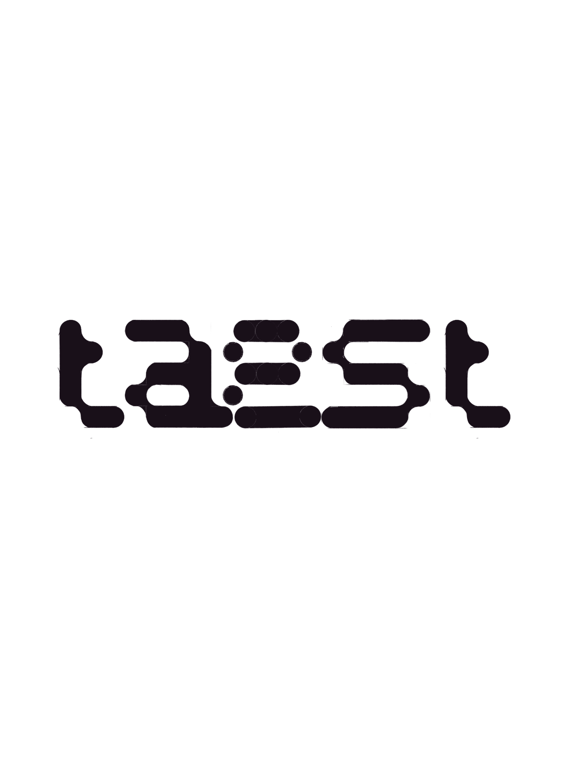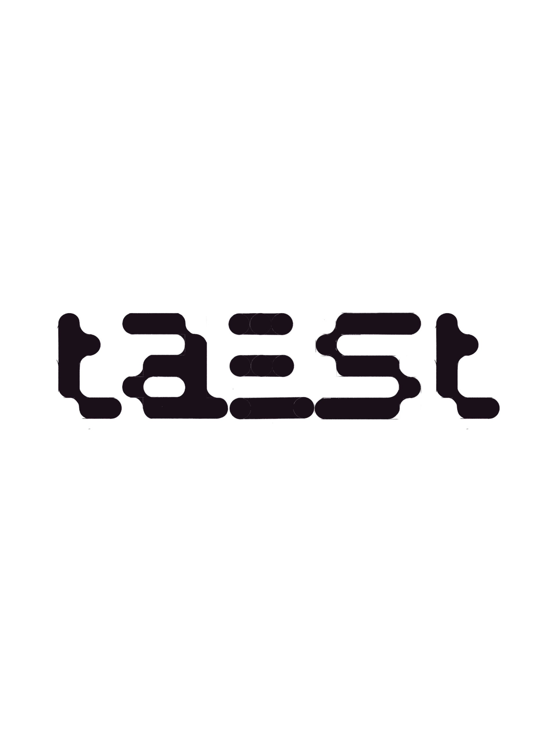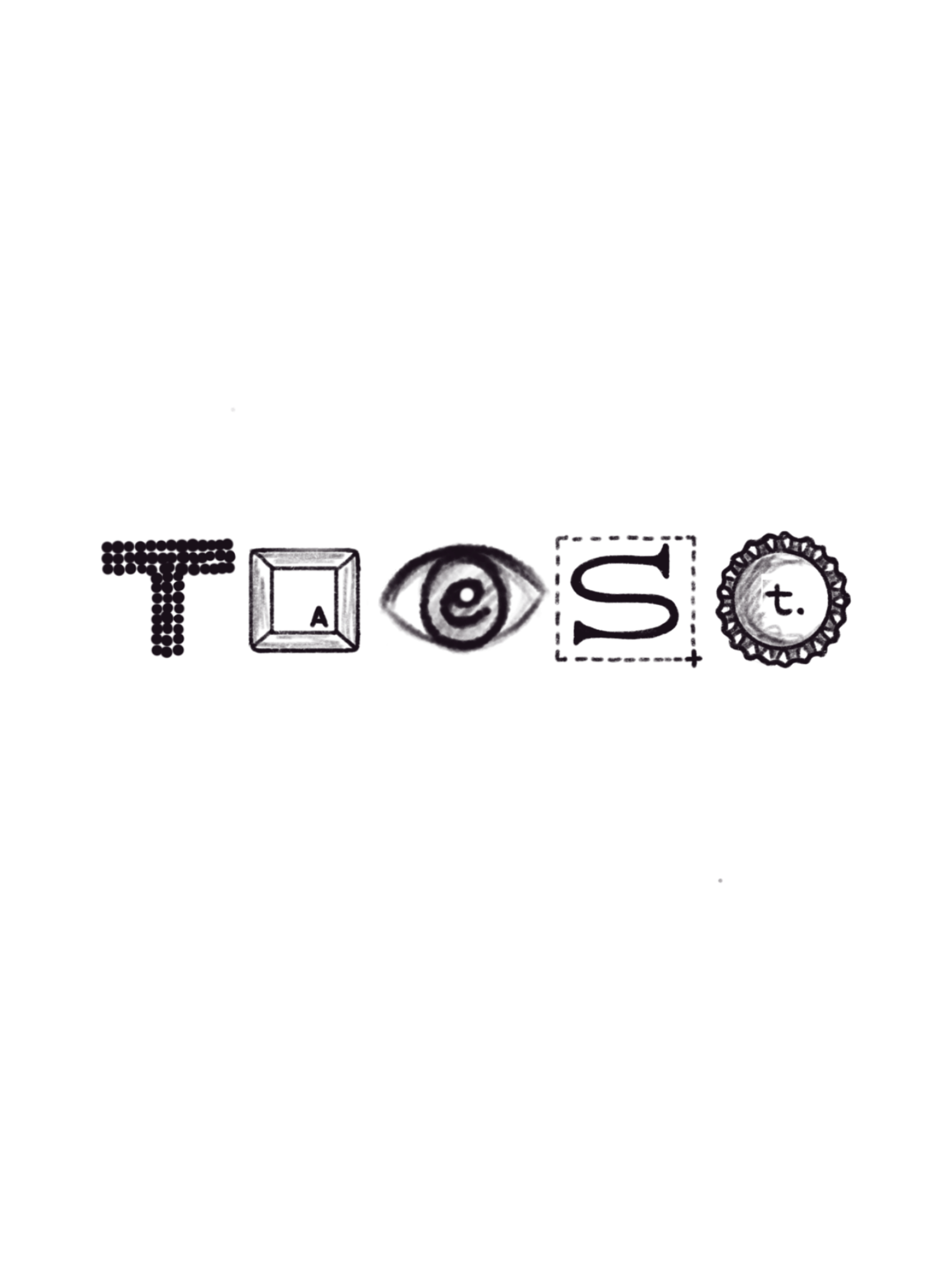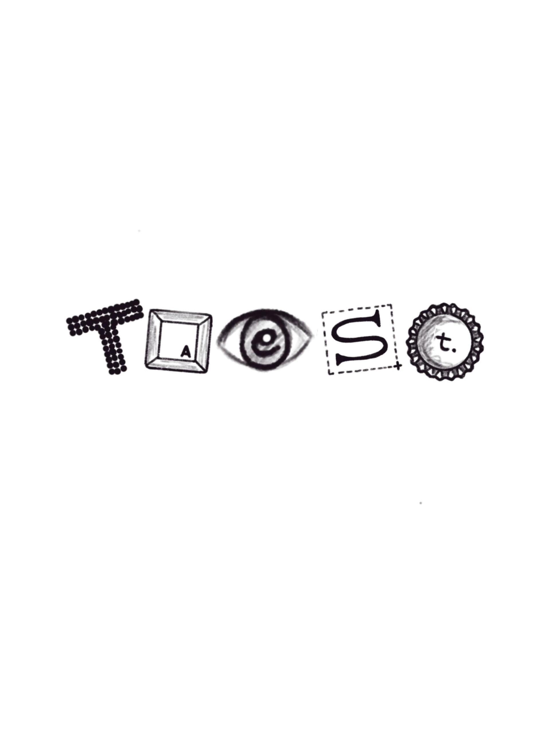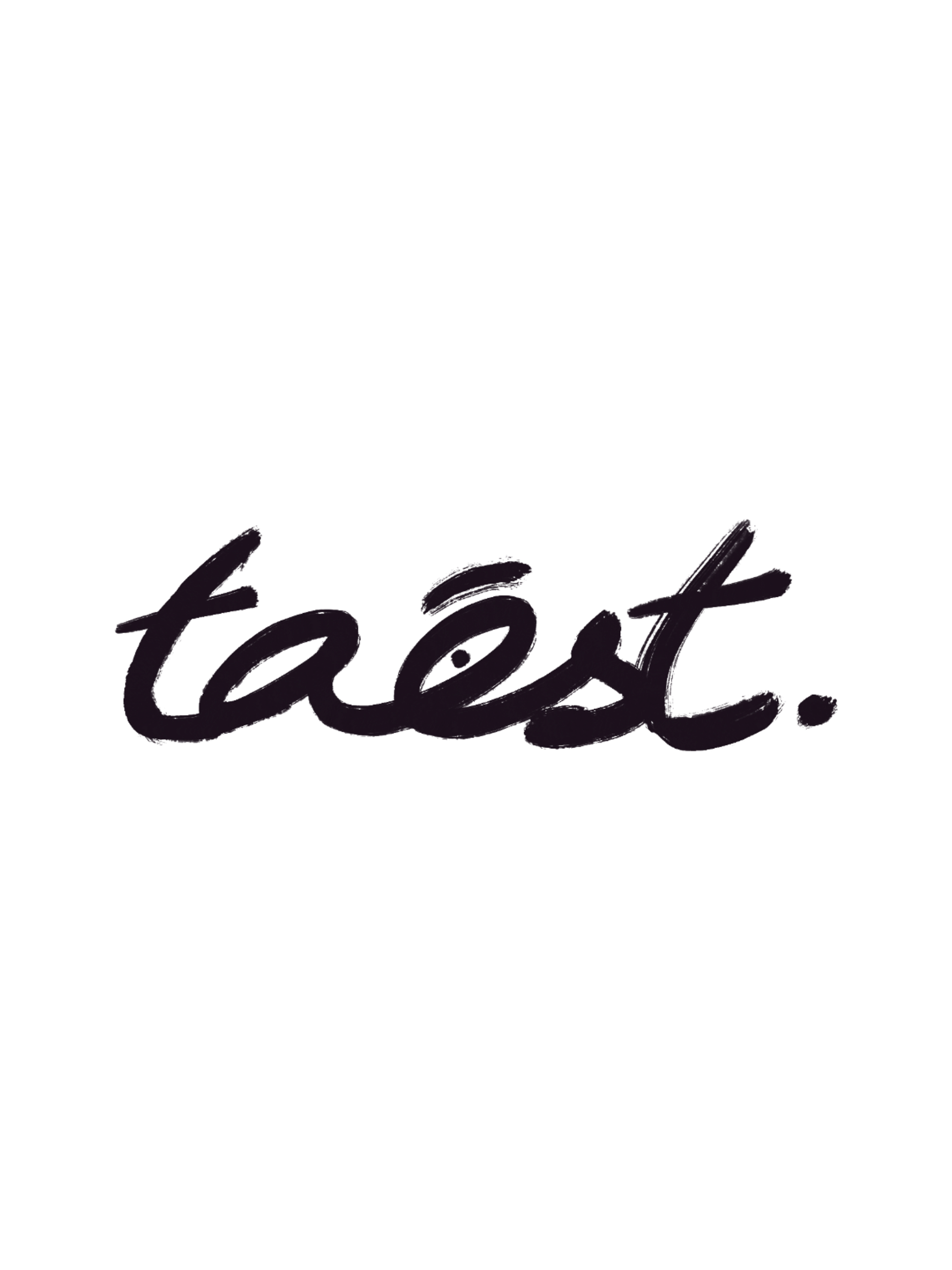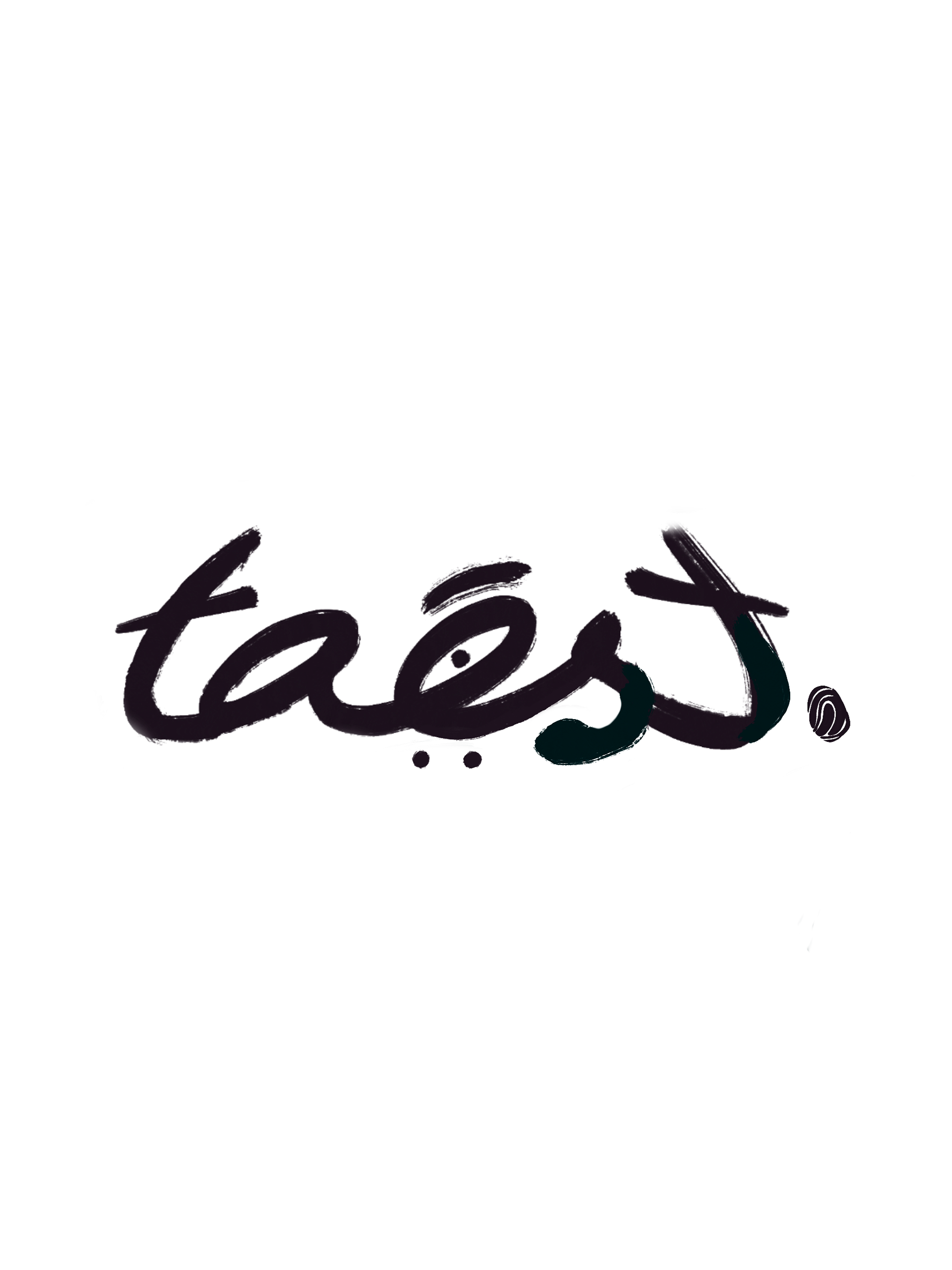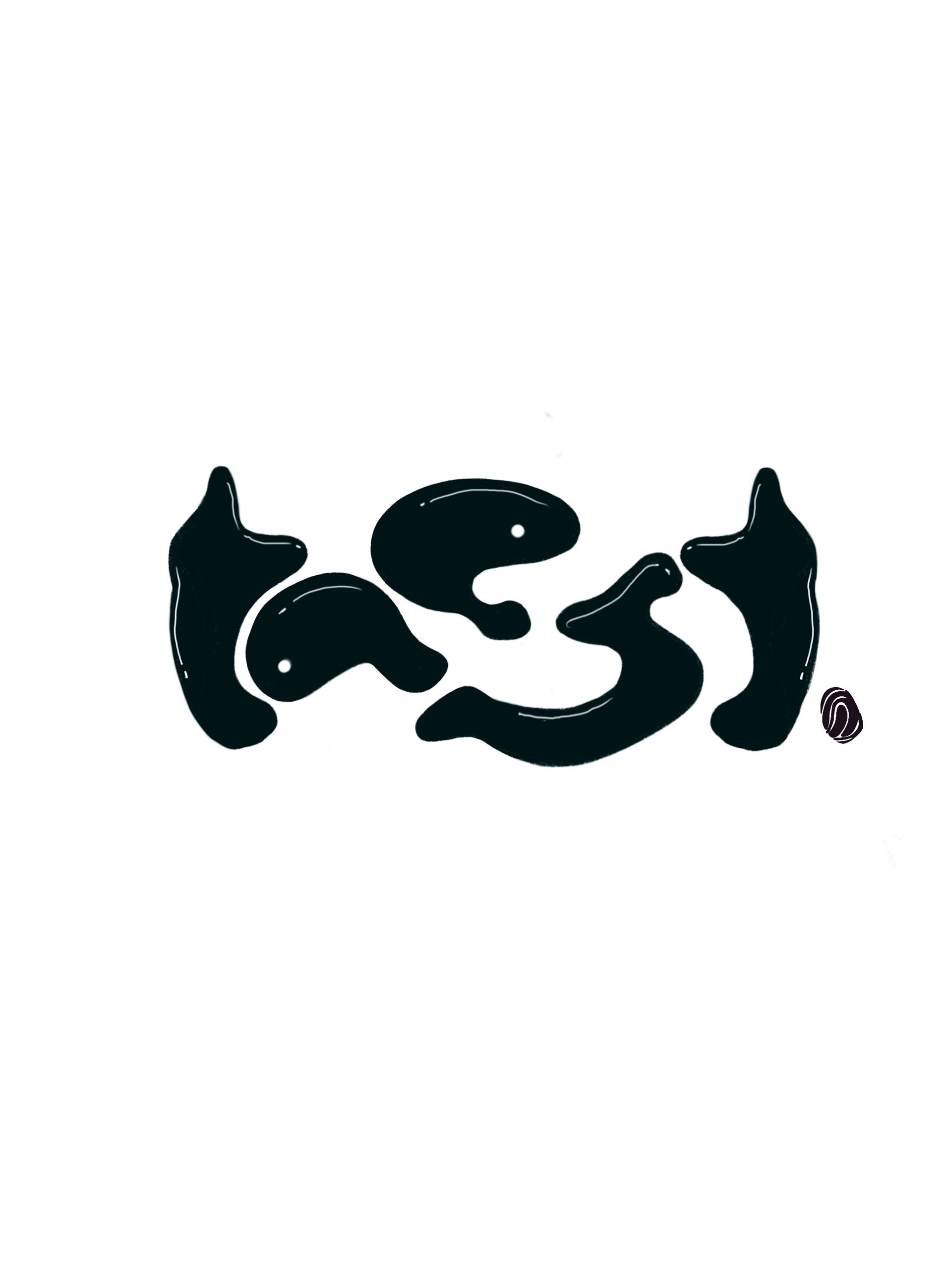


This liquid free flowing typography helped us capture the brand's heightened senses for things tasteful.
Starting with the sharp eyes captured by the alphabets 'a' and 'e'.
Starting with the sharp eyes captured by the alphabets 'a' and 'e'.
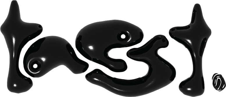
The elongated extensions of letters 'a' and 'e'
depicted the brand's nose that can smell all tasteful things from a mile.
depicted the brand's nose that can smell all tasteful things from a mile.

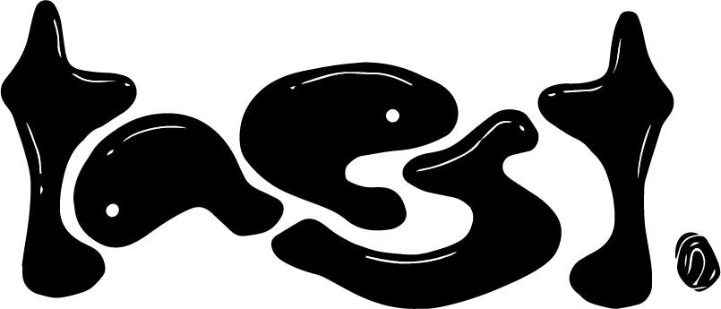
We went one step further with the two 'ts' facing each other, symbolising the brand's ear for a good ring.
The thumbprint at the end served dual purpose - adding impact as well as
capturing the brand's touch on the current cultural and creative landscape.
The thumbprint at the end served dual purpose - adding impact as well as
capturing the brand's touch on the current cultural and creative landscape.
All the above combined senses put together, forms the word taest -
the brand's single minded proposition and creative core.
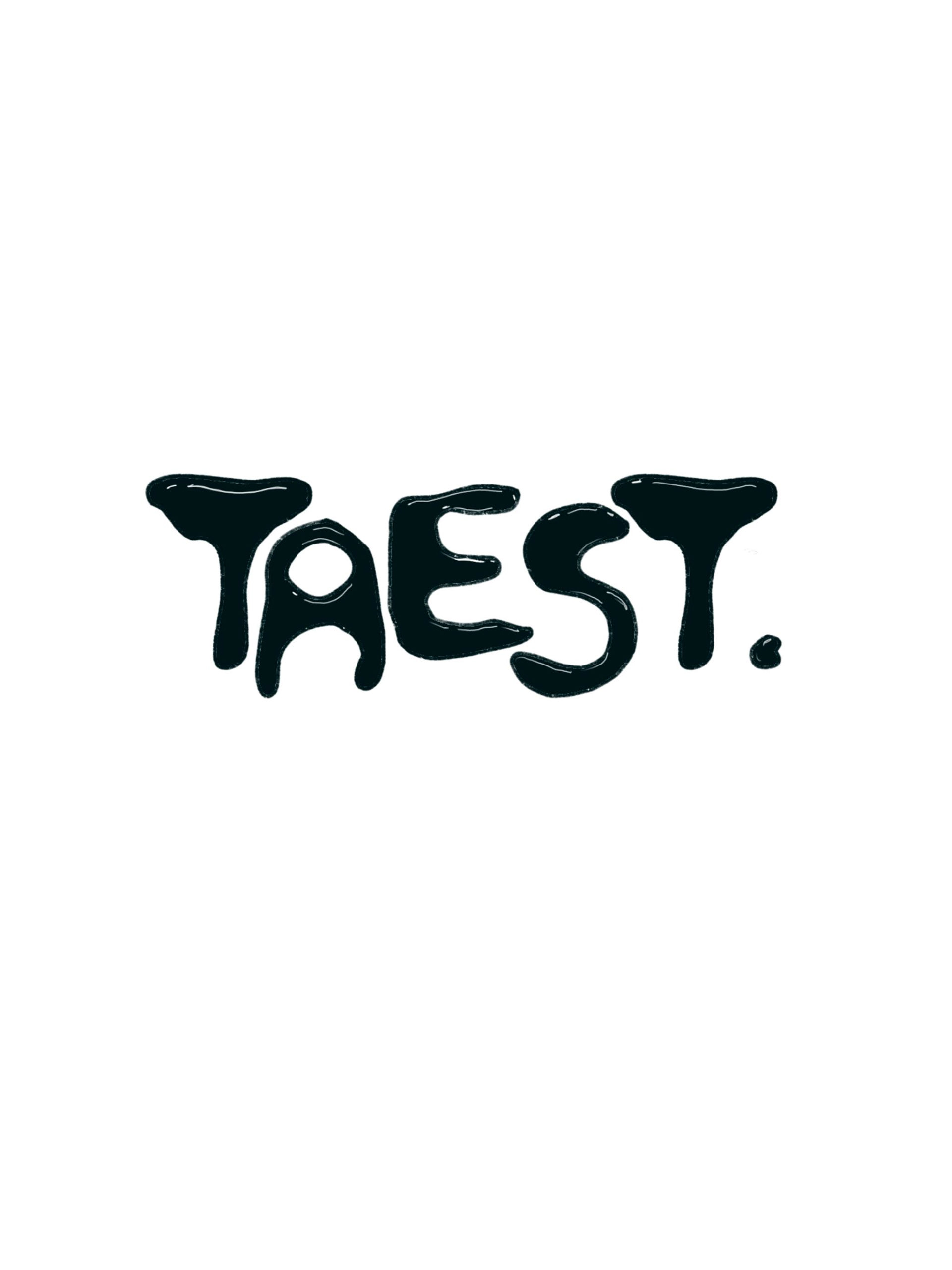
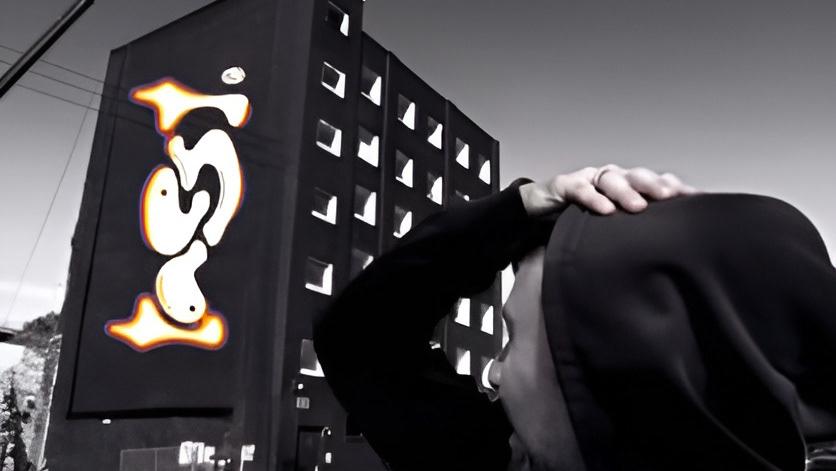
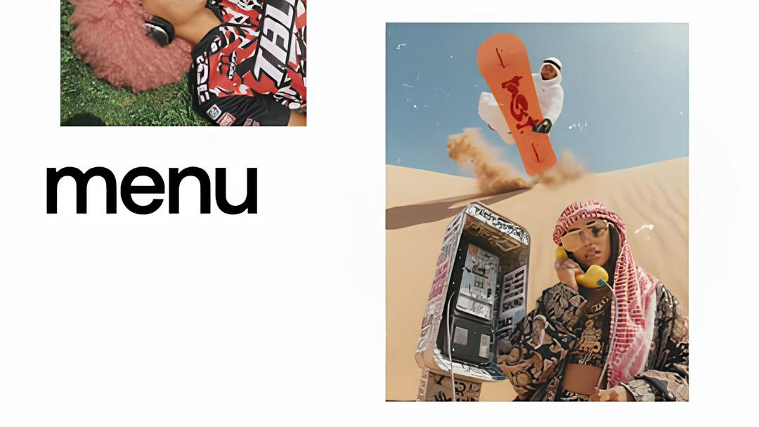
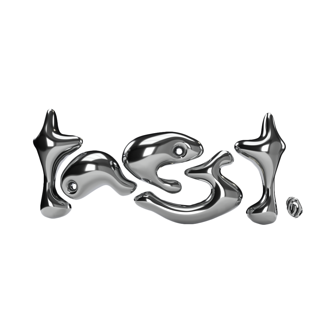
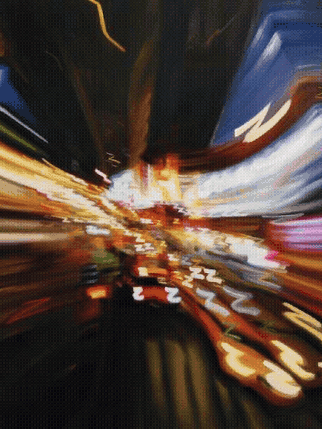
It was now time to see it as a living breathing extension of the space that it'll eventually occupy. 🏟️🎡🎫📬🗽
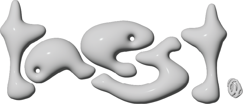
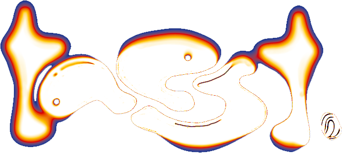
So, we put our logo through what we call a texture-test - a great barometer for our visual identity’s versatility and extendability.
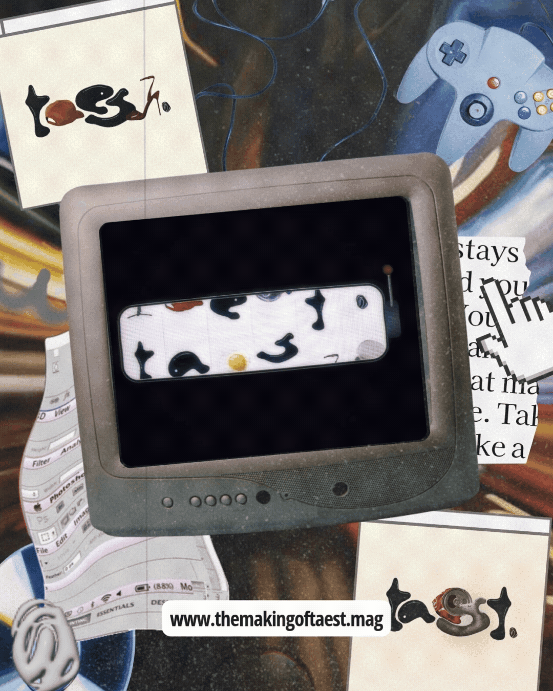
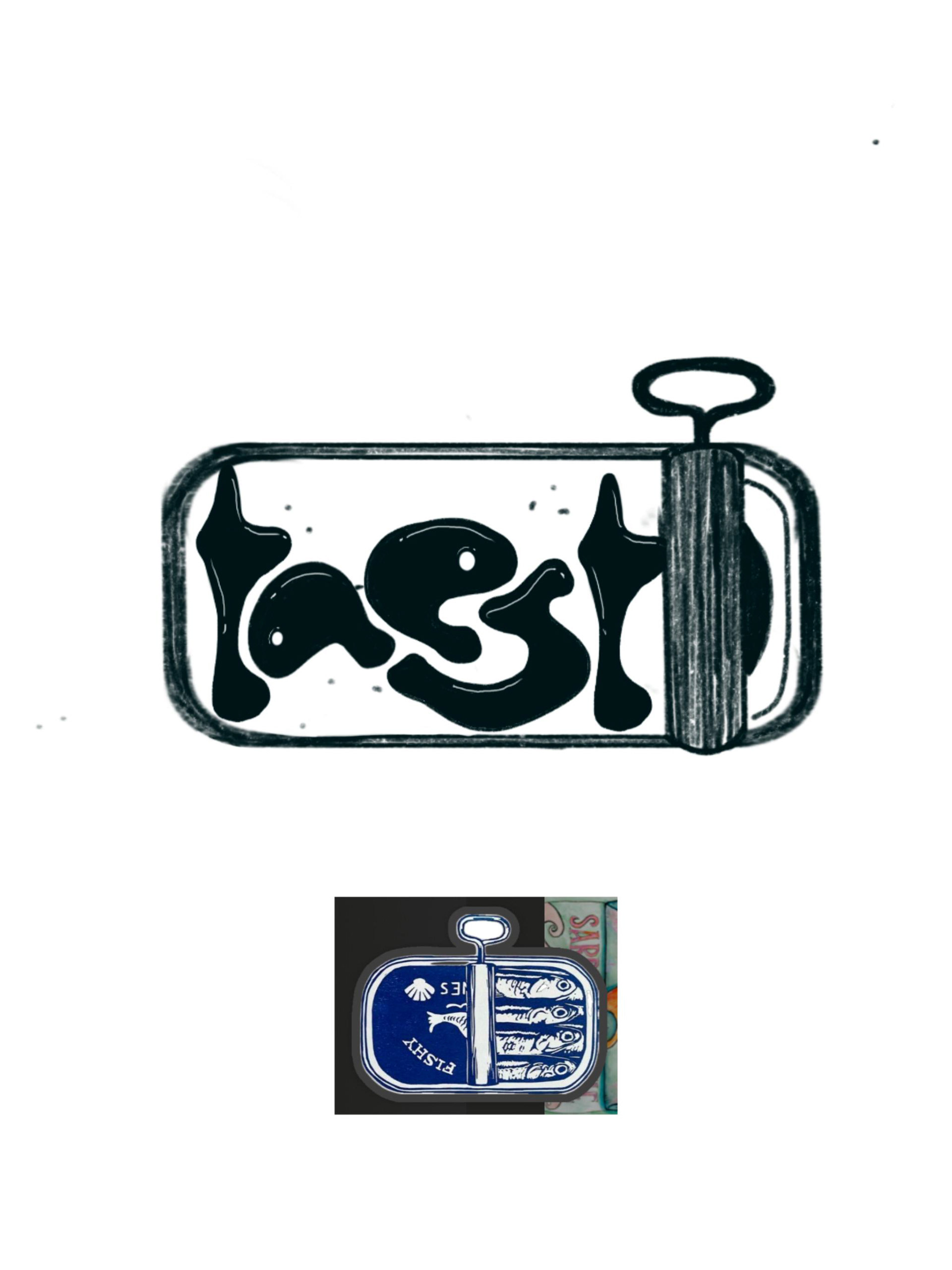
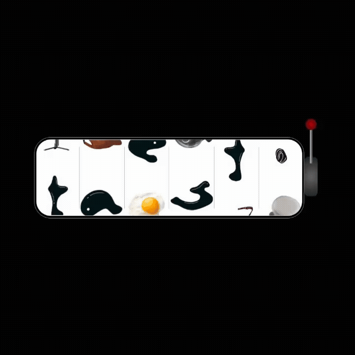
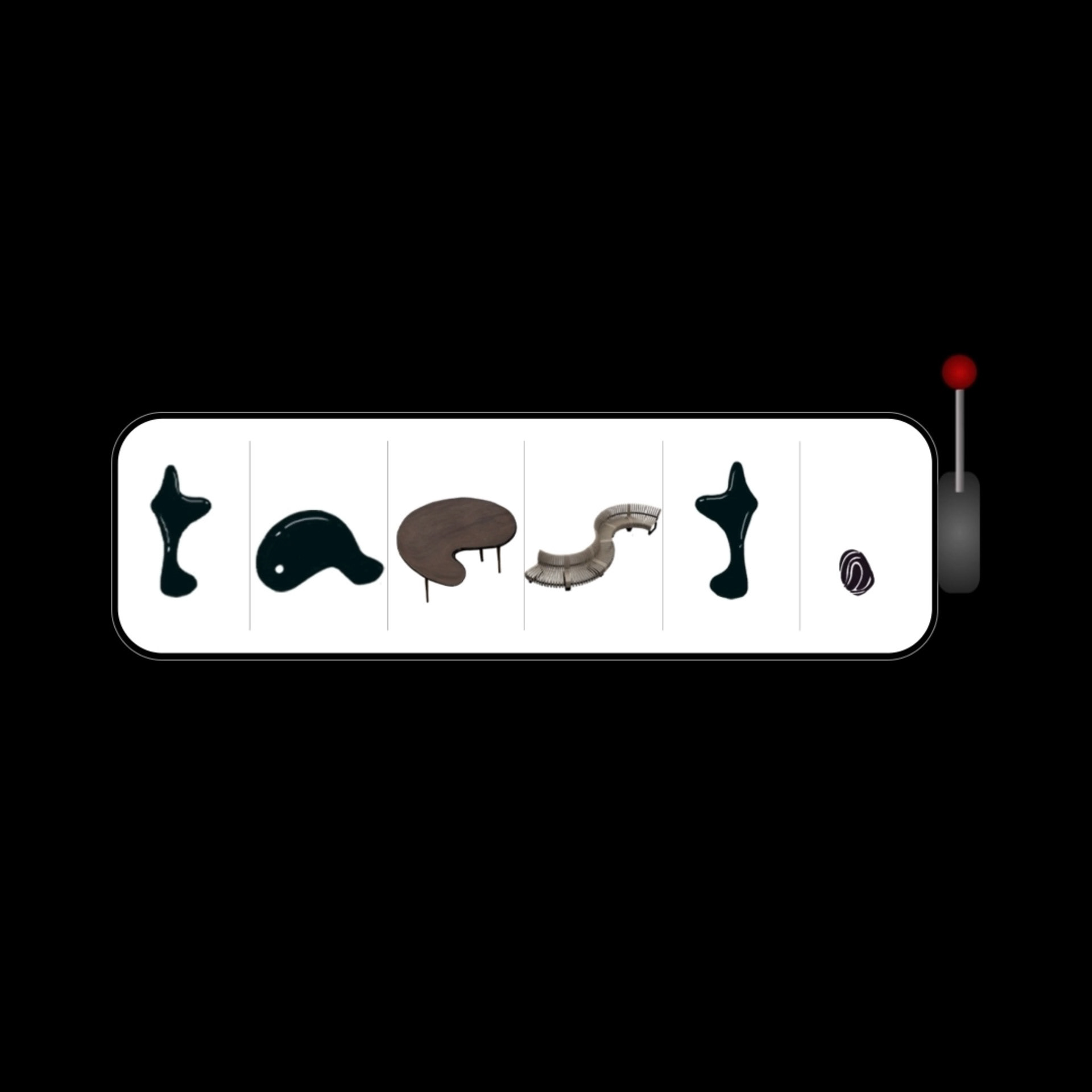
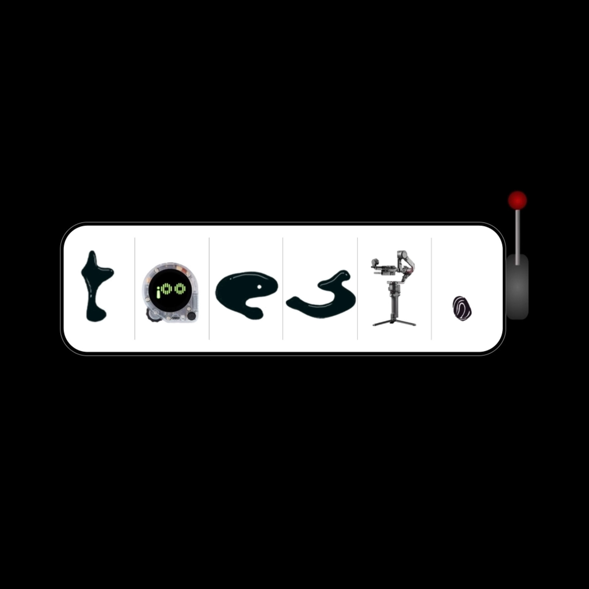
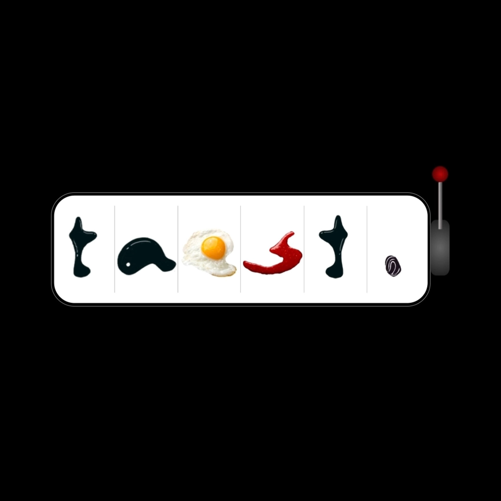
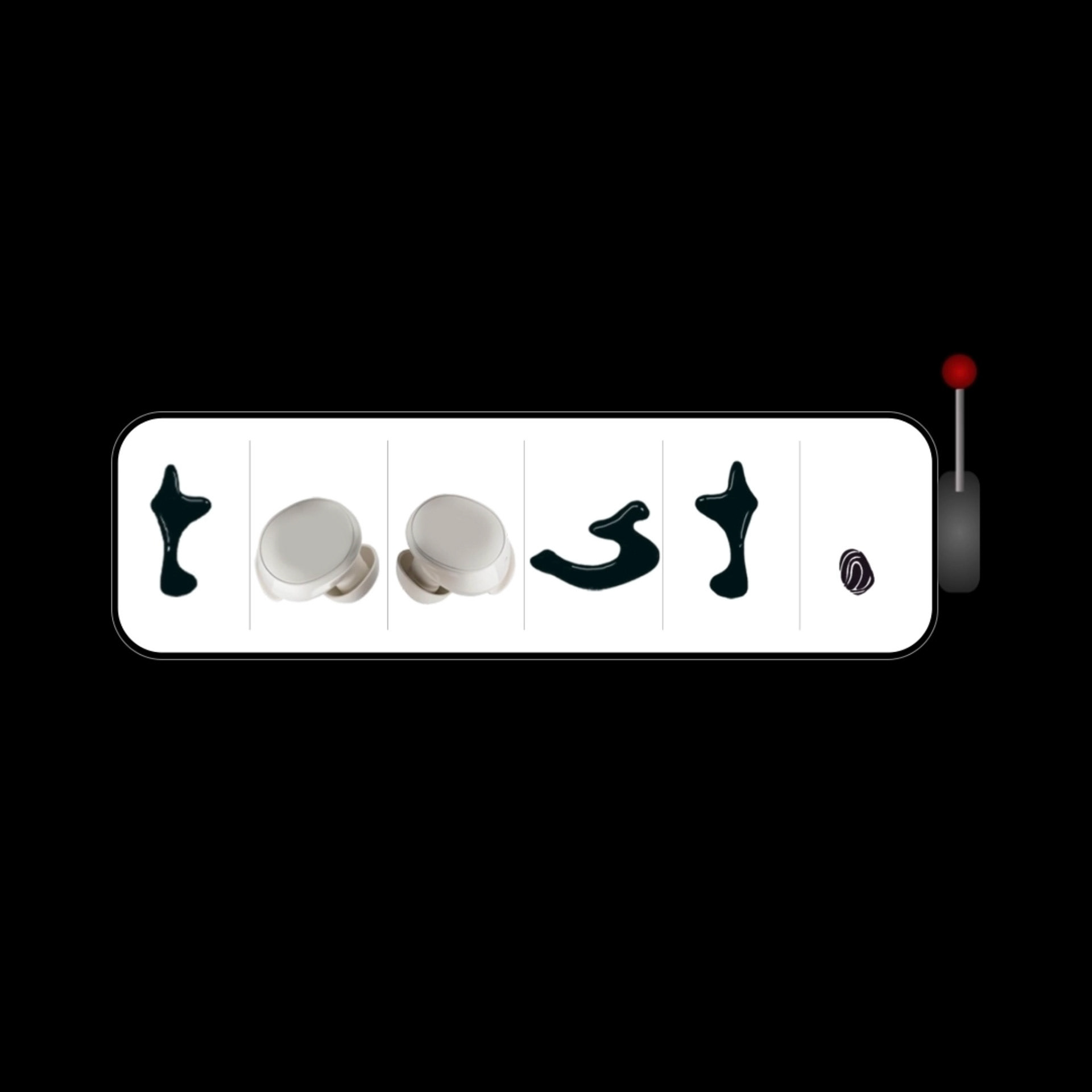
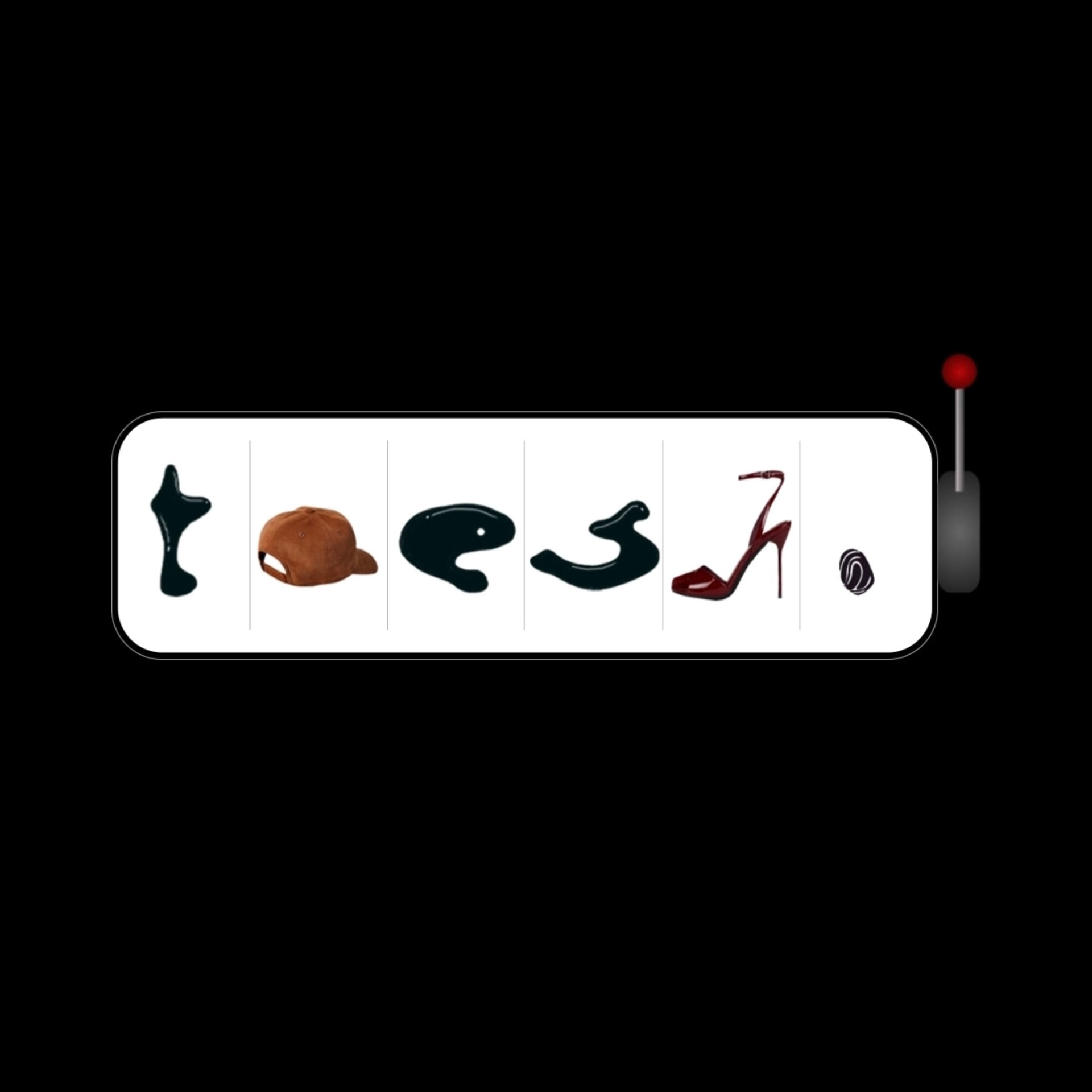
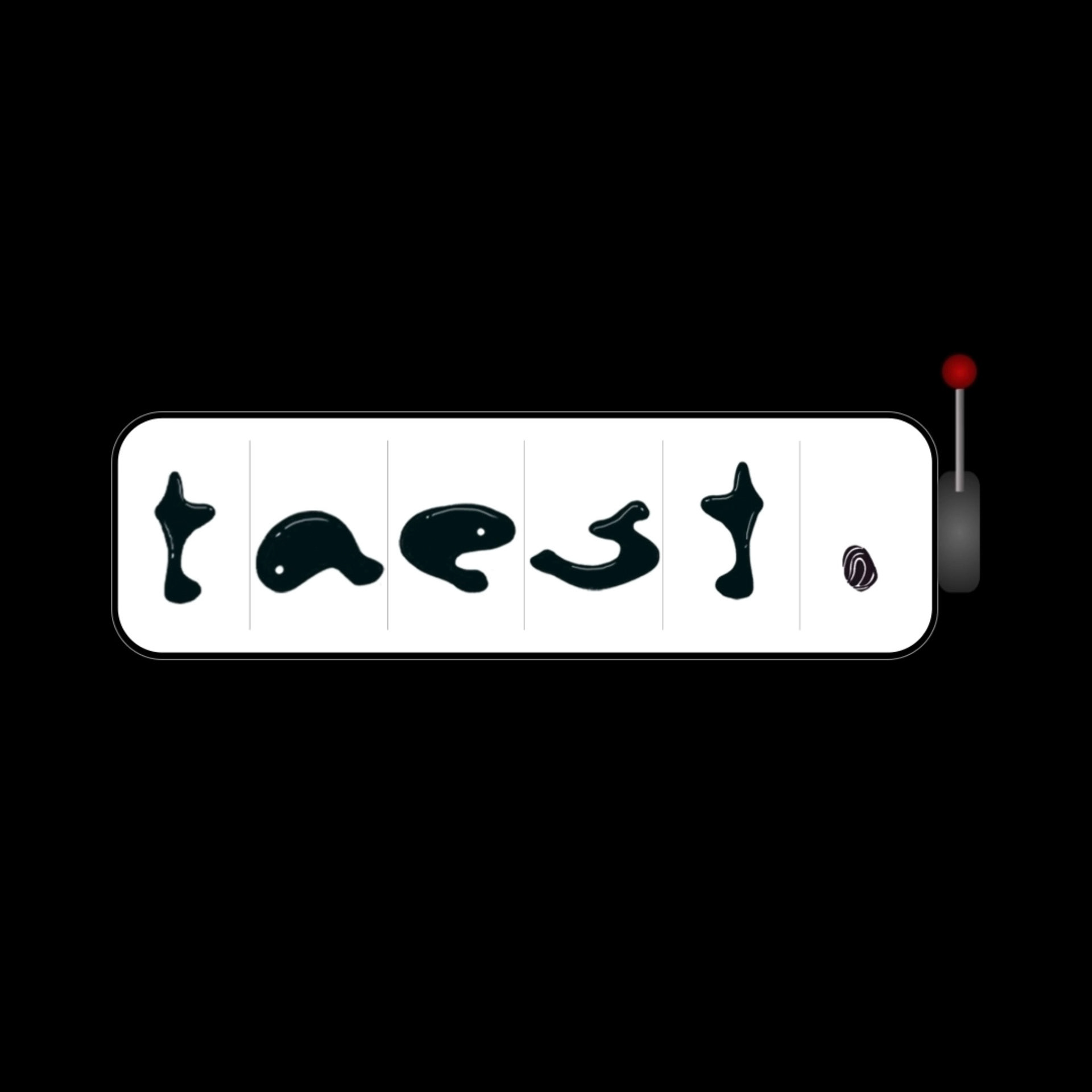
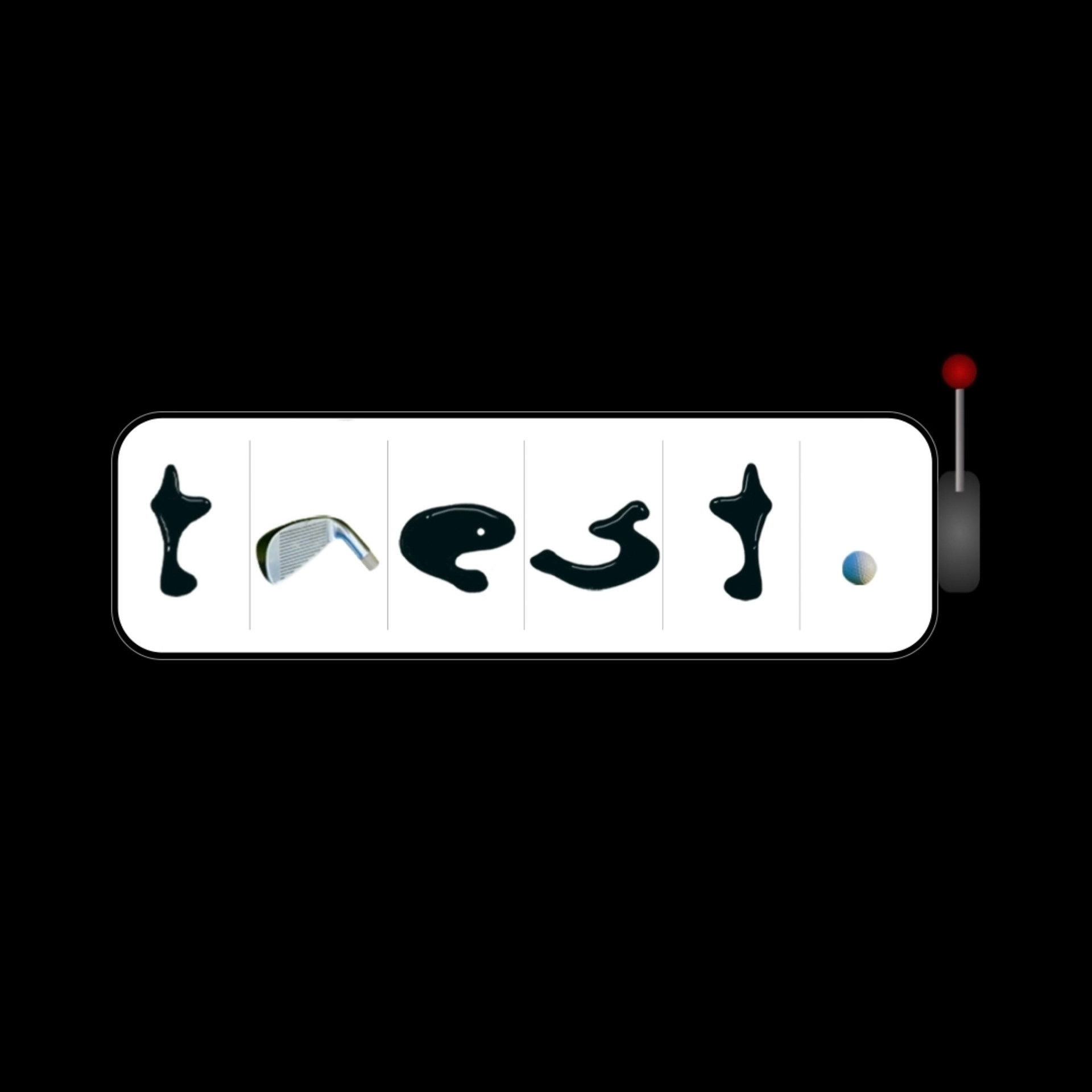
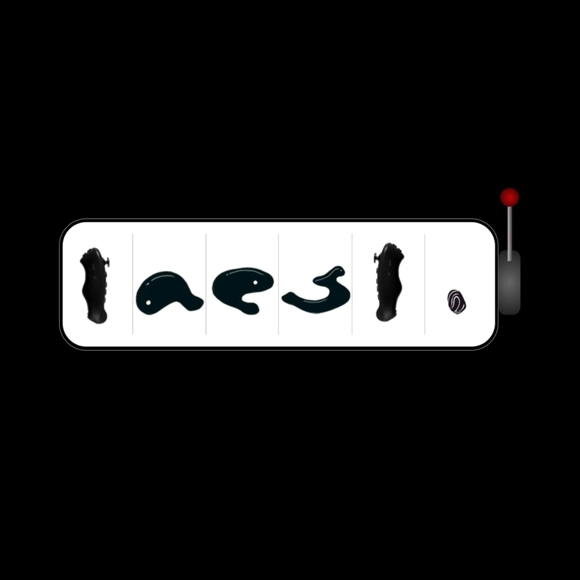
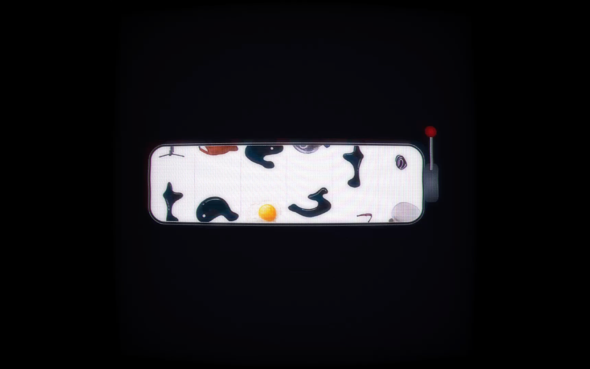
Next, came the task of creating the logo animation. We locked in on a casino slot machine to symbolise
the rewarding nature of the brand. With every crank of the level of the taest slot machine,
a whole new world of possibilities would open up.
the rewarding nature of the brand. With every crank of the level of the taest slot machine,
a whole new world of possibilities would open up.
The retro-futuristic taest logo animation
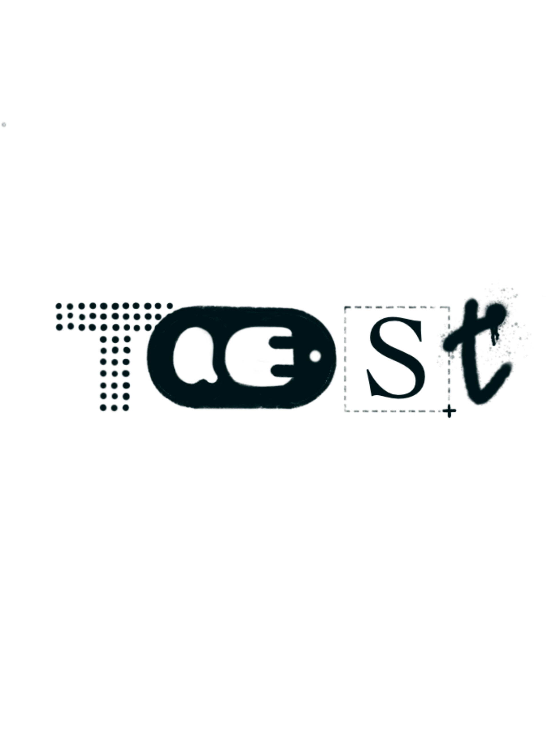
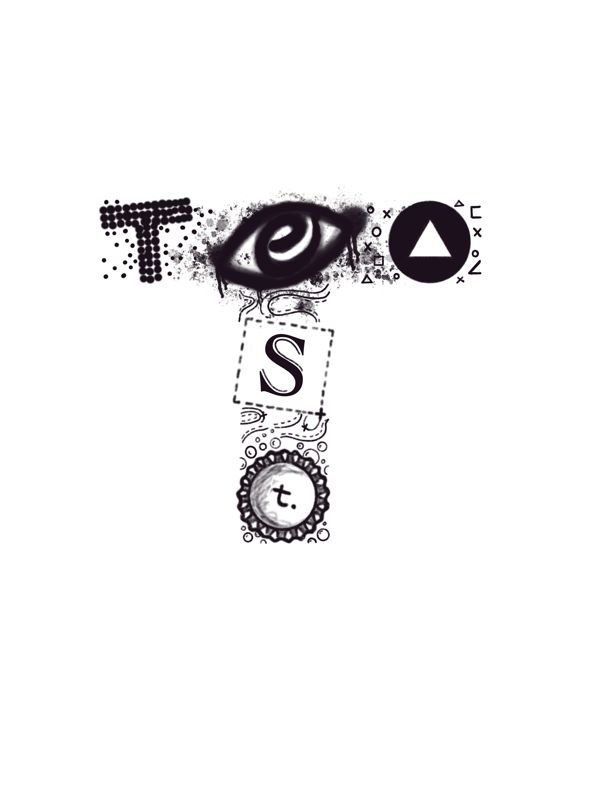
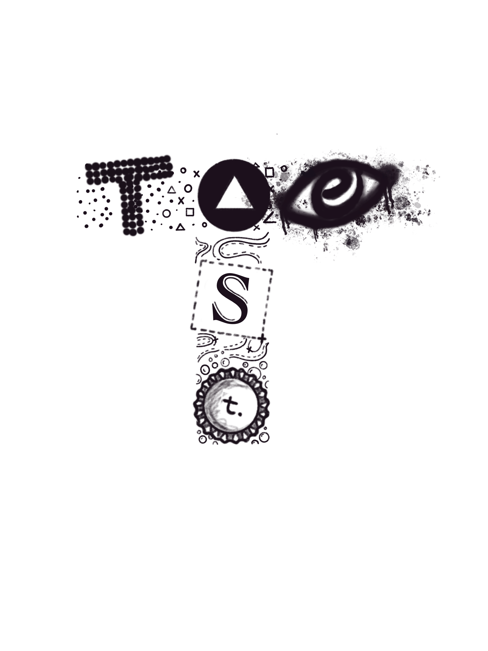
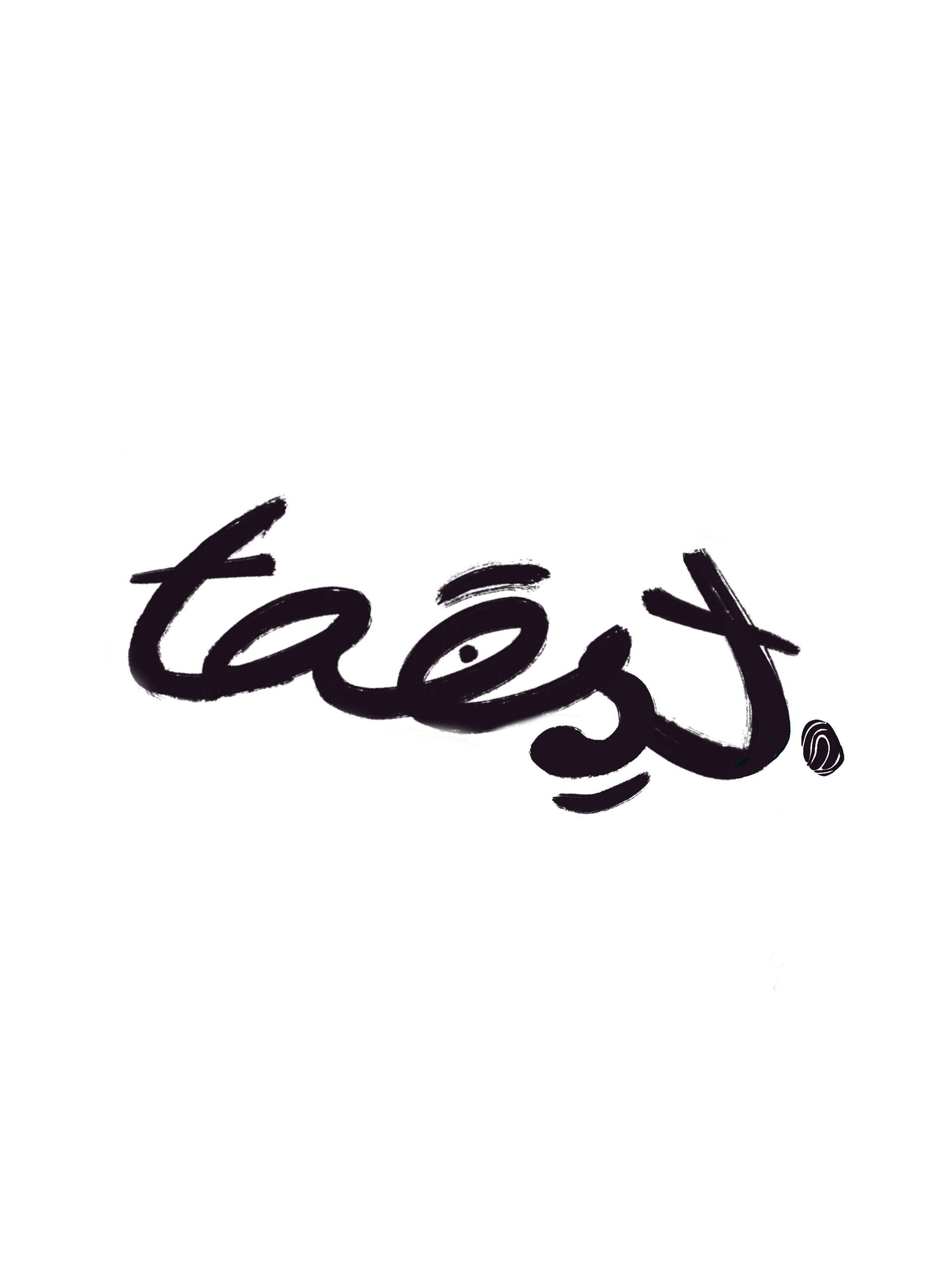
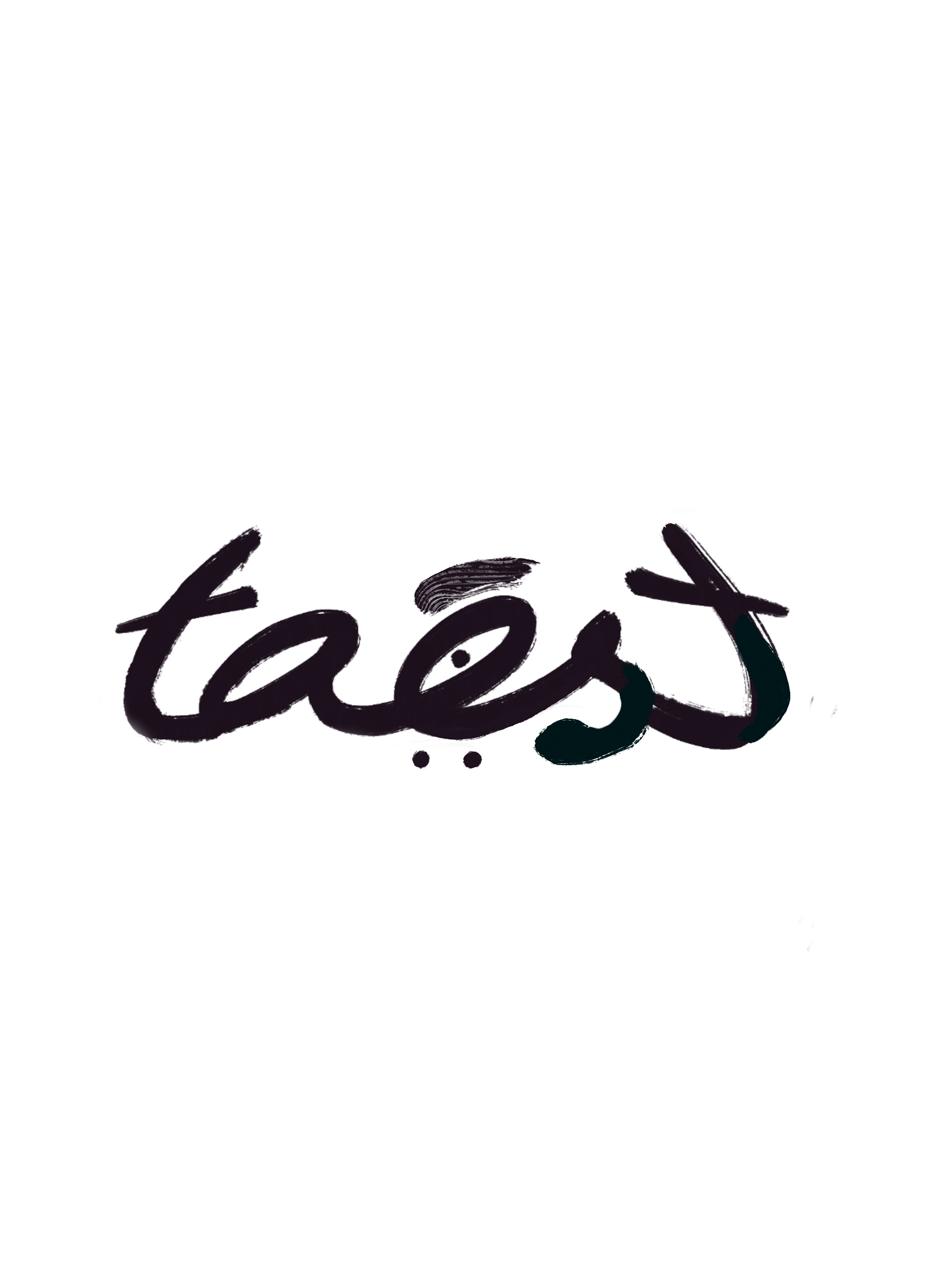
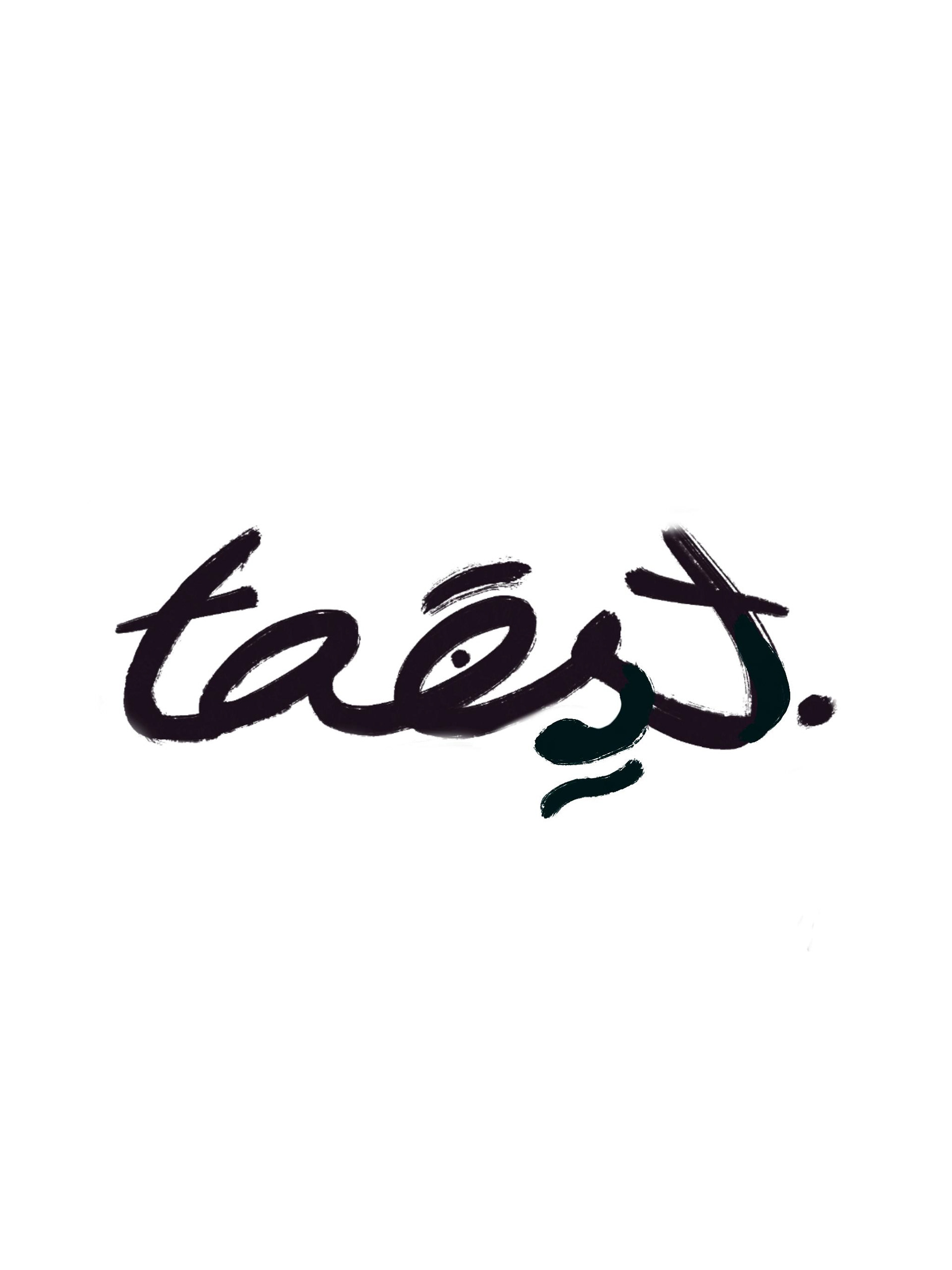
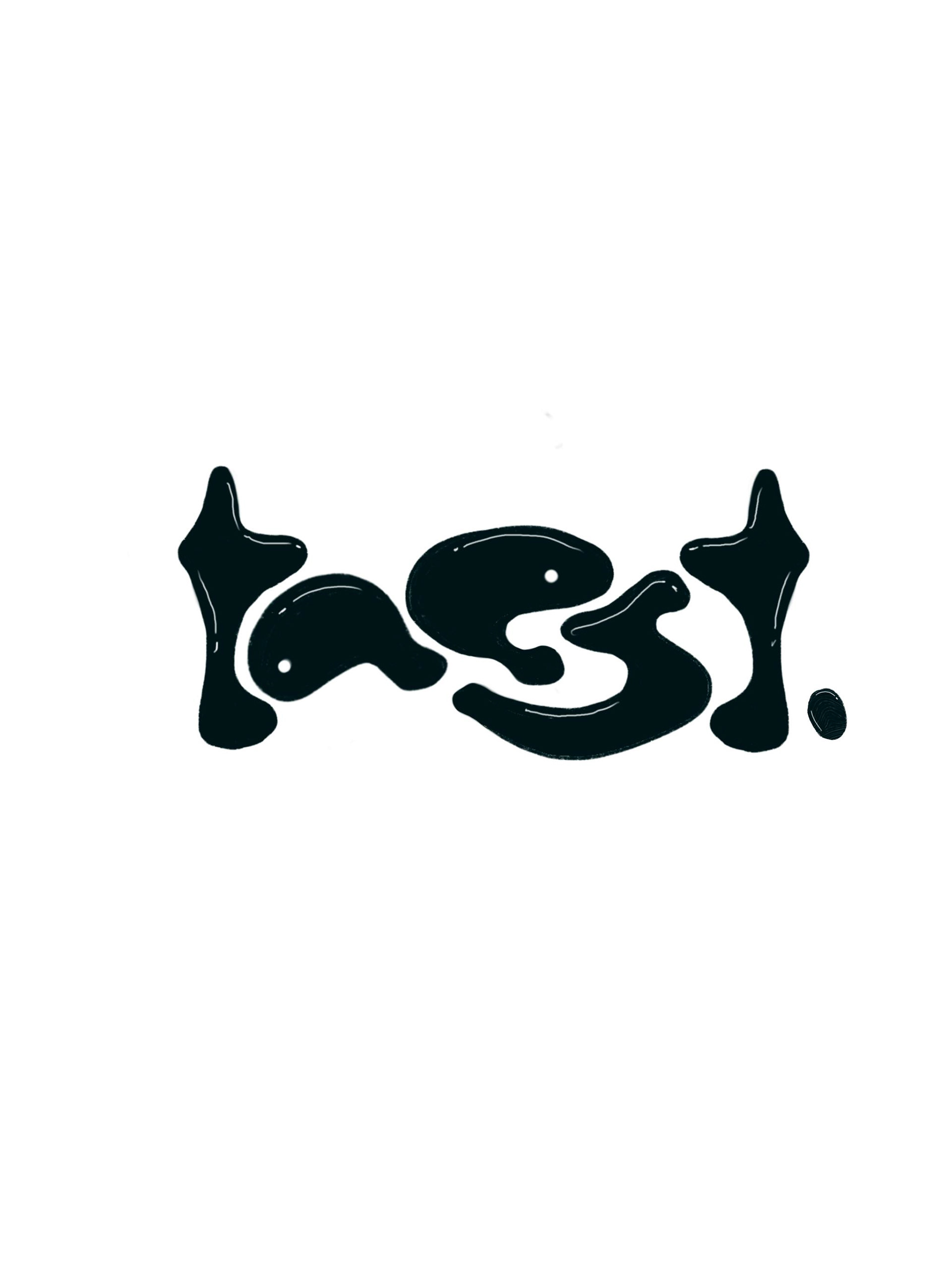
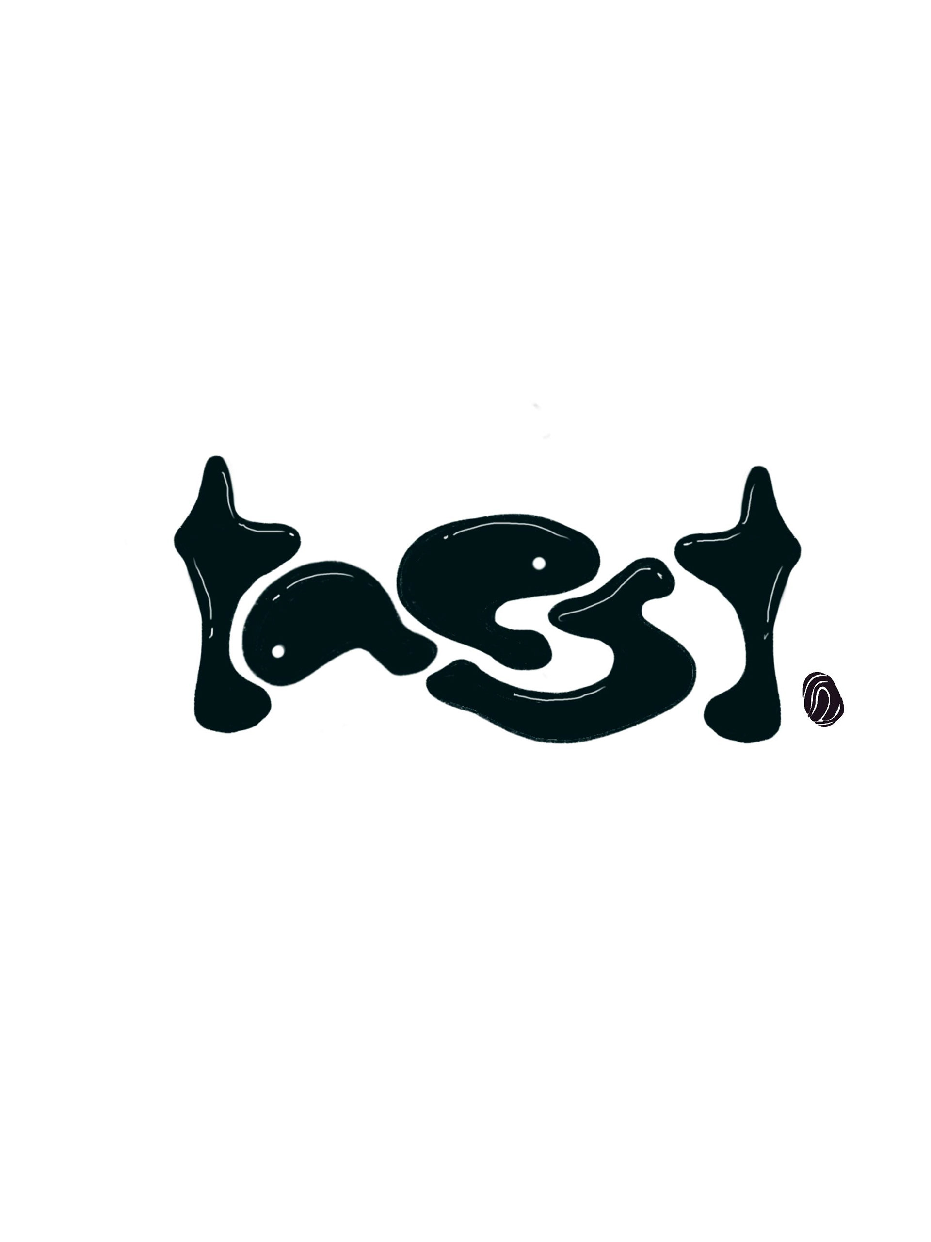
All of this wasn't without the many trial and errors.
All the no-go logos however did shape the final logo that went on to see the light of the day.
All the no-go logos however did shape the final logo that went on to see the light of the day.
The evolution of the taest logo.